If you haven’t read Parts One or Two, you might want to start here.
At SALA Architects, I use 6 pen sets on a standard project. In this post I’m going to discuss the basics of two:
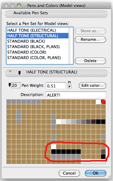
one pen set, for structural drawings: HALF TONE (STRUCTURAL)
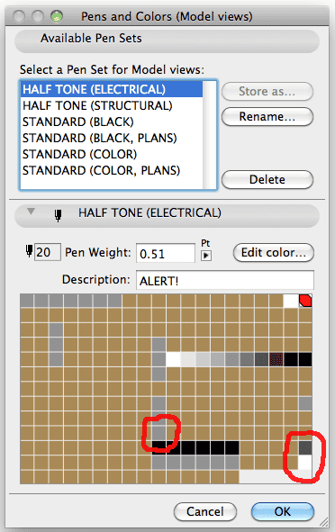
one pen set, for electrical drawings: HALF TONE (ELECTRICAL)
 |
 |
As I mentioned in Part One, setting a view to grayscale in the layout book isn’t good enough for me. I want every pen to go gray uniformly. And I want some pens to not go gray at all. What I want is a half-tone background and nice black information on top. In the images above you’ll notice that most, but not all the pens go to gray. Unused pens stay brown. I want those pens to jump out and scream “You’re not doing it right! Fix me!” Even someone who doesn’t use ArchiCAD will know something is wrong on a printed drawing when there’s five brown lines amidst a sea of grayscale. Pen 20 stays red. Pen 220 is always a 75% gray. Pens 91-100 never change either. They are always a gradation from white to black. I find it nice to have access to those pens for various fills. I’ll use pen 100 on layouts (since it’s always black and a decent line weight), but otherwise I never use those pens for anything but fills.
I now need to talk about notations for a moment. My notations (leaders, dimensions, text, section/elevation markers, etc.) use a unique set of pen numbers: pens 230 to 235 for architectural drawings and pens 210 to 215 for structural/electrical drawings. Isolating notations makes reading views on the screen easier; I will never confuse a dimension or a leader line for something that it’s not. Separate pens also improves options for find and select. I can select only objects with pen 230 and not accidentally select something I shouldn’t. If I turn off all layers except the dimension layer and I see something that’s not pens 230 to 235, then I know there’s a mistake. And if when I go to print, a boss thinks all dimension lines should be thinner or all arrows need to be fatter, then it’s a few quick clicks and no collateral damage. Again it’s all about isolation of data.
Notations for grayscale plans use a different set of pens, just one step up. So if text is usually pen 232, then for grayscale it’s 212. Visually it’s very easy to change the pens of a dimension to read in black in a grayscale plan. When changing a dimension to read black, just move the pens up one in the pen chart. I don’t need to know that it goes from pen 231 to 211. I just need to know in the chart where it starts. Each pair of pens (Pen 212 and 232, Pen 215 and 235, etc.) look the same in the STANDARD (BLACK) pen set. That way a dimension that needs to read black on both architectural drawings (black and white) and structural drawings (grayscale) looks the same as a regular dimension that would show black on architectural and gray on structural.
Why two grayscale pen sets? For now the difference is pen 190 and pen 240, but separate pen sets allows for further differentiation in the future. Pen 190 is the pen used for wall fills. In structural plans I don’t want to see poché in walls unless they’re bearing walls (pen 170). In electrical plans I want to see the poché. Pen 240 is white in all pen sets except structural. This allows me to fill posts and columns with this pen. On the structural plan these objects will show up as black and pop out. On every other drawing they’ll be white. Before I started using this pen I had to draw black fills over columns so that they’d show up correctly on the structural plan. Now it’s built into the pen set. And if I decide black rectangles don’t look right, I can easily change them to 75% gray or 60% gray or whatever I want without effecting anything else. And since how objects merge in section and plan depend on fill type and not pen number, those functions aren’t effected either. A column cut in section with empty fill and pen 240 will merge properly when it meets a slab with empty fill and pen 91–in the section view both 240 and 91 are white, and the fills match.
UPDATE March 24, 2014 – I finally wrote Pen Sets, Part 4. You can find it over on BIM Engine. Also keep an eye out for Parts 5 and 6 coming soon after Part 4.
11 thoughts on “Pen Sets, Part Three”
Most of the default windows and doors have contour lines on Pen 3, and many of the objects such as kitchen cupbds have a default contour pen of 4. Do you know why this is the case? I tried to make my pens simple by making 1-10 the same as pens 0.1-1.0, but have to go and change the contours lines from 3 or 4 back to 1 all the time. How do you get around this one?
Greg, as I recall the idea behind ArchiCAD’s pens is that there are specific pens for all sorts of different elements and objects. I think that’s a horrible solution and am a firm believer that pens should be unified across all types and be more about final production. Why have 4 pens that always have the same line weight? Just have one! So you and I are on the same page there.
The solution I use is favorites. I originally used visual favorites (elements off to the side or in another file that I could copy or eyedropper to get my correct settings), but have since gone almost completely to using the favorites palette within ArchiCAD. It’s really a must. That way you can easily save then select your standard windows, doors, text, polylines, etc. and have them all in every project. At first I used the favorites for saving elements with correct pens and fills, but now also have them set up to better materials.
With the rationalization of objects (windows/doors) in ArchiCAD 16, using favorites will get even better.
Hi Jared
thanks for your reply – I did start to set up favourites -I will develop this further if AC16 has even more improvements!
Will I have to redo all the favourites with AC16 windows, doors, objects, or do you think the settings will be transferred automatically?
Greg, with every new version most, but not all the favorites will transfer. And other favorites you’ll just want to update anyways. Walls for instance will transfer without a problem, but you might find it’s time to update your standards. Objects are always a little trickery. My guess is that windows and doors won’t transfer favorites to 16 because of how much they have been consolidated into newer, better, and fewer objects.
So if you’re going to switch over to 16 in a month, which I think we all should do, don’t spend too much time setting up window, door, skylight, and object favorites. Save those for ArchiCAD 16 in mid-June and focus on the rest. The switch for doors and windows in 16 to 17 will be simpler!
Jared,
Do your old SALA pensets work well with Bobrow’s Master Template? I have been using the template for about 6 months, and am ready to bail on it since AMT basically forces you to use the crummy AC10 pens. Sure you can use your old pens, but then you are facing the same problems Greg points out regarding library parts & pens #3/4.
Cheers!
I’m not that familiar with Master Template’s pen choices. My pensets (or a variation of them, which is what I use now), would require you updating all the visual favorites and favorites to match them. So it should work without a problem. You’ll just spend a day or however long revamping his template to work with another set of pens. Better maybe to see if you can just tweak the pen weights and colors of the AC10 pens to look better. Not sure which would be easier. Better maybe to take what you’ve learned from the Master Template and create a clean template of your own? I don’t know. I’ve been thinking about templates A LOT recently. I’m trying to find some time to do something about that too.
Pingback: Pen Sets, Part Six: the 3D Window – GRAPHISOFT North America
Pingback: Pen Sets: Part Four – GRAPHISOFT North America
Pingback: Pen Sets, Part Seven: it's time to break from color = thickness – GRAPHISOFT North America
Pingback: Pen Sets, Part Eight: Thoughts on Naming – GRAPHISOFT North America
Pingback: Pen Sets, Part Nine: Graphic Overrides – GRAPHISOFT North America