If you haven’t read Part One, you might want to start here.
At SALA Architects, I use 6 pen sets on a standard project. In this post I’m going to discuss the basics of two:
one pen set, with colors: STANDARD (COLOR)
one pen set, with colors but some different line weights: STANDARD (COLOR, PLANS)
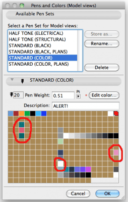
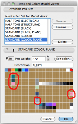
In Pen Sets, Part One I briefly discussed why color = line weight. Let’s continue that train of thought. The two major pens/ line weights in my drawings are pen 43/0.5 mm and pen 160/0.1 mm. In a drawing, if I see a green line I know it’s .5 mm; if I see a pink line I know it’s .1 mm. However, there are objects and parts of objects that need to change from one to the other depending on the view. Wall ends at windows are one example. I want heavy lines at window openings in plan, but light lines in sections. This is done with pen 63. Sometimes I want the reverse; light on plans, heavy elsewhere. This is done with pen 83. And two pen sets. Here’s the breakdown:
| Pen Number | Thickness/Color (Standard Pen Set) | Thickness/Color (Plans Pen Set) | Notes |
| 43 | .5mm/green | .5mm/green | Wall contours, section cuts (airline) |
| 63 | .5mm/green | .1mm/pink | |
| 83 | .1mm/pink | .5mm/green | |
| 160 | .1mm/pink | .1mm/pink |
Skin lines, uncut in section |
The pinks and greens of pens 63 and 83 are not exactly the same colors as 43 and 160. They are slightly off. This allows two options for visual recognition. In the greater context all the greens for these pens look the same and all the pinks look the same. The differences vanish and one isn’t distracted. But next to each other it is clear on screen that 43 is different from 63 or 83. This allows for visual verification on screen via color that the correct pen was used (ei, my walls won’t go to .1mm in section because they were accidentally drawn with pen 63).
Why do I have a special pen for cut lines/walls? If the cut line is not the right thickness, I can alter the pen without affecting anything else. Also, when I go to grayscale or half-tone plans, I can darken the walls without messing up anything else. This allows me to have 75% gray walls and 50% everything else without any oddballs.
The other major difference between the two pen sets is pen 190. 190 is purple on plans (eventually gray when printed) and white elsewhere. This allows me to poché the stud space of my walls in plan and have uniformly white walls in section. More on that and other special pens later. Hint: it’s about control of information balanced against utility.
This is probably also a good time to mention that the pen numbers I use (#1-7, 19-20, 43, 63, 70, 83, 90-100, 110, 150, 160, 170, 190, 210-215, 220, 230-235, & 240) are based on a template SALA Architects first used with ArchiCAD 6.5 (which was itself based on national CAD standards). In an attempt for continuity with the past, I based our v11 template on that structure. I shouldn’t have. If I where to rework my pen choices from scratch, I would use the same philosophy but not necessarily the same pen numbers.

